A single observation that is substantially different from all other observations can make a large difference in the results of your regression analysis. If a single observation (or small group of observations) substantially changes your results, you would want to know about this and investigate further. There are three ways that an observation can be unusual.
Outliers: In linear regression, an outlier is an observation with large residual. In other words, it is an observation whose dependent-variable value is unusual given its values on the predictor variables. An outlier may indicate a sample peculiarity or may indicate a data entry error or other problem.
Leverage: An observation with an extreme value on a predictor variable is called a point with high leverage. Leverage is a measure of how far an observation deviates from the mean of that variable. These leverage points can have an effect on the estimate of regression coefficients.
Influence: An observation is said to be influential if removing the observation substantially changes the estimate of coefficients. Influence can be thought of as the product of leverage and outlierness.
The following is reference from stackexchange.
We need to understand three things:
- leverage,
- standardized residuals, and
- Cook's distance.
To understand leverage, recognize that Ordinary Least Squares regression fits a line that will pass through the center of your data, (\(\bar{X}\), \(\bar{Y}\)) . The line can be shallowly or steeply sloped, but it will pivot around that point like a lever on a fulcrum. We can take this analogy fairly literally: because OLS seeks to minimize the vertical distances between the data and the line*, the data points that are further out towards the extremes of \(\bar{X}\) will push / pull harder on the lever (i.e., the regression line); they have more leverage. One result of this could be that the results you get are driven by a few data points; that's what this plot is intended to help you determine.
Another result of the fact that points further out on X have more leverage is that they tend to be closer to the regression line (or more accurately: the regression line is fit so as to be closer to them) than points that are near \(\bar{X}\). In other words, the residual standard deviation can differ at different points on X
(even if the error standard deviation is constant). To correct for this, residuals are often standardized so that they have constant variance (assuming the underlying data generating process is homoscedastic, of course).
One way to think about whether or not the results you have were driven by a given data point is to calculate how far the predicted values for your data would move if your model were fit without the data point in question. This calculated total distance is called Cook's distance. Fortunately, you don't have to rerun your regression model N times to find out how far the predicted values will move, Cook's D is a function of the leverage and standardized residual associated with each data point.
With these facts in mind, consider the plots associated with four different situations:
- a dataset where everything is fine
- a dataset with a high-leverage, but low-standardized residual point
- a dataset with a low-leverage, but high-standardized residual point
- a dataset with a high-leverage, high-standardized residual point
import pandas as pd
import numpy as np
import itertools
from itertools import chain, combinations
import statsmodels.formula.api as smf
import scipy.stats as scipystats
import statsmodels.api as sm
import statsmodels.stats.stattools as stools
import statsmodels.stats as stats
from statsmodels.graphics.regressionplots import *
import matplotlib.pyplot as plt
import seaborn as sns
import copy
from sklearn.cross_validation import train_test_split
import math
import time

%matplotlib inline
plt.rcParams['figure.figsize'] = (12, 8)
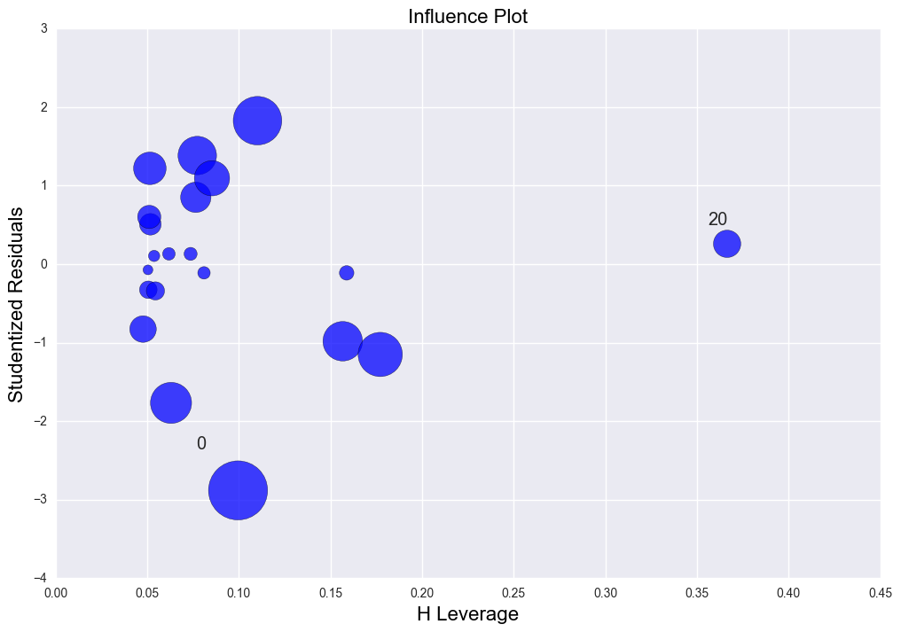
case 1. erveything is fine. As is shown in the leverage-studentized residual plot, studenized residuals are among -2 to 2 and the leverage value is low. R2 is 0.576.
np.random.seed(0)
x1 = np.random.normal(20, 3, 20)
y0 = 5 + 0.5 * x1
y1 = 5 + 0.5 * x1 + np.random.normal(0, 1, 20)

lm = sm.OLS(y1, sm.add_constant(x1)).fit()
print "The rsquared values is " + str(lm.rsquared)

plt.scatter(np.sort(x1), y1[np.argsort(x1)])
plt.scatter(np.mean(x1), np.mean(y1), color = "green")
plt.plot(np.sort(x1), y0[np.argsort(x1)], label = "actual")
plt.plot(np.sort(x1), lm.predict()[np.argsort(x1)], label = "regression")
plt.title("Linear Regression plots with the regression line")
plt.legend()

fig, ax = plt.subplots(figsize=(12,8))
fig = sm.graphics.influence_plot(lm, alpha  = 0.05, ax = ax, criterion="cooks")
The rsquared values is 0.575969602822
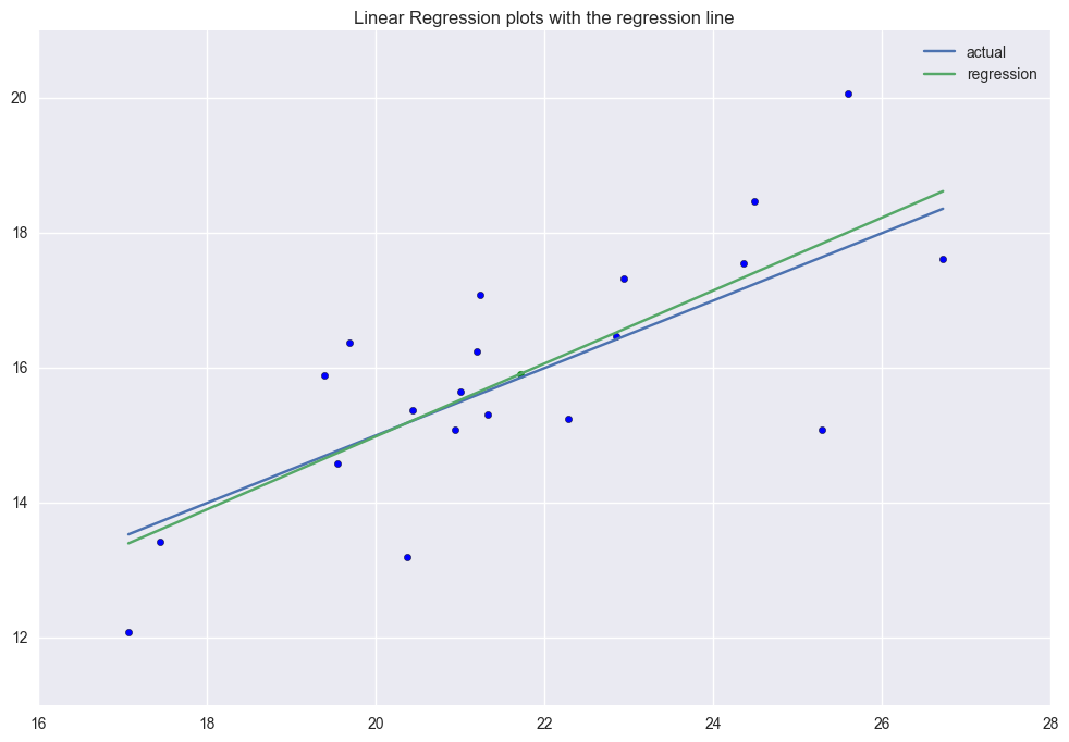
The first graph includes the (x, y) scatter plot, the actual function generates the data(blue line) and the predicted linear regression line(green line). The linear regression will go through the average point \((\bar{x}, \bar{y})\) all the time.
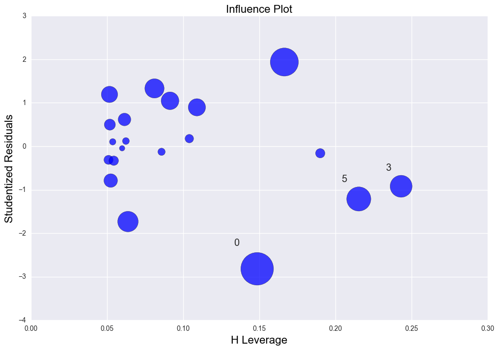
The second graph is the Leverage v.s. Studentized residuals plot. y axis(verticle axis) is the studentized residuals indicating if there is any outliers based on the alpha value(significace level). It shows point 0(the first data point) is like an outlier a little based on current alpha. Point 5 and 3 are high leverage data points. Generally there isn't any issue with this regression fitting.
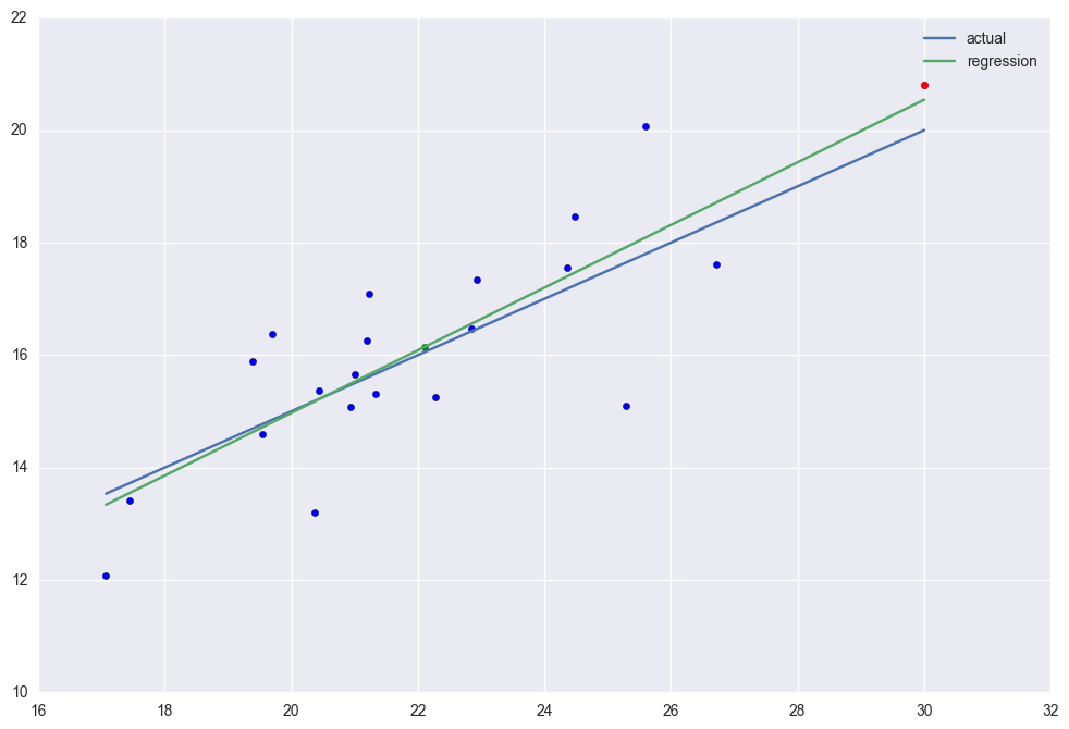
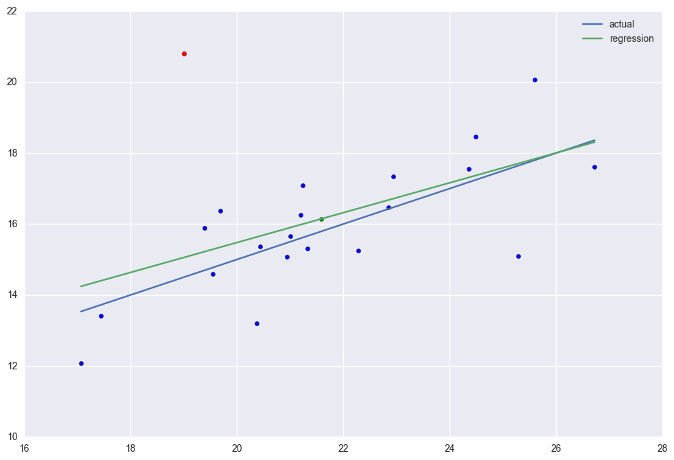
case 2. There is high leverage point (30, 20.8). This point has higher leverage than the others but There is no outliers. Because of this, its R2=0.684 which is higher than the case 1.
x2 = np.r_[x1, 30]
y2 = np.r_[y1, 20.8]
y20 = np.r_[y0, 20]

lm2 = sm.OLS(y2, sm.add_constant(x2)).fit()
print "The rsquared values is " + str(lm2.rsquared)

plt.scatter(np.sort(x2), y2[np.argsort(x2)])
plt.scatter(30, 20.8, color = "red")
plt.scatter(np.mean(x2), np.mean(y2), color = "green")
plt.plot(np.sort(x2), y20[np.argsort(x2)], label = "actual")
plt.plot(np.sort(x2), lm2.predict()[np.argsort(x2)], label = "regression")
plt.legend()
plt.plot()

fig, ax = plt.subplots(figsize=(12,8))
fig = sm.graphics.influence_plot(lm2, ax= ax, criterion="cooks")
The rsquared values is 0.68352705876
case 3. There is an outlier (19, 20.8). It has high normalized residual. Different from high leverage point, the outlier will distort the regression line thus the R2 is down to 0.274.
x3 = np.r_[x1, 19]
y3 = np.r_[y1, 20.8]
y30 = np.r_[y0, 5 + .5 * 19]

lm3 = sm.OLS(y3, sm.add_constant(x3)).fit()
print "The rsquared values is " + str(lm3.rsquared)

plt.scatter(np.sort(x3), y3[np.argsort(x3)])
plt.scatter(19, 20.8, color = "red")
plt.scatter(np.mean(x3), np.mean(y3), color = "green")
plt.plot(np.sort(x3), y30[np.argsort(x3)], label = "actual")
plt.plot(np.sort(x3), lm3.predict()[np.argsort(x3)], label = "regression")
plt.legend()
plt.plot()

fig, ax = plt.subplots(figsize=(12,8))
fig = sm.graphics.influence_plot(lm3, ax= ax, criterion="cooks")
The rsquared values is 0.27377526628
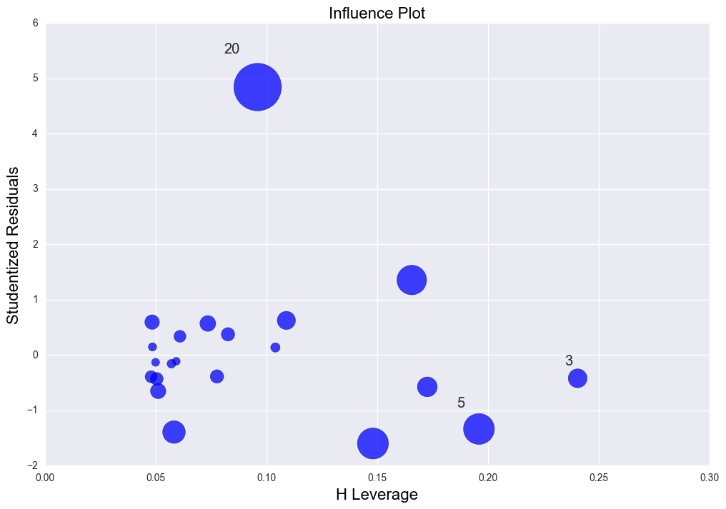
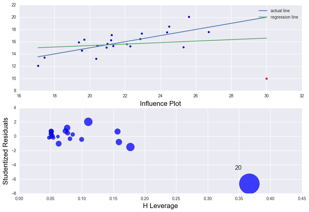
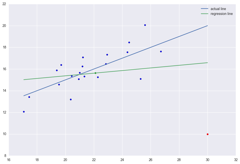
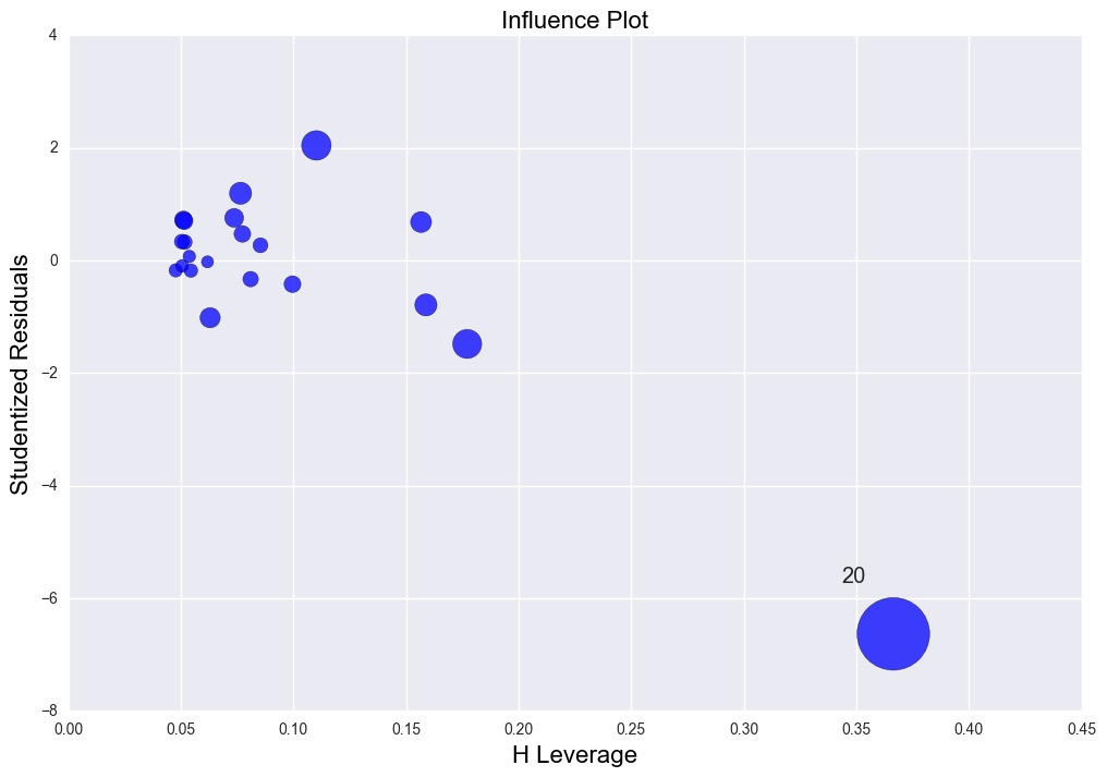
There is high leverage and outlier point (30, 10). The regression line was distorted severely. R2 = 0.029 which is very low.
x4 = np.r_[x1, 30]
y4 = np.r_[y1, 10]
y40 = np.r_[y0, 20]

lm4 = sm.OLS(y4, sm.add_constant(x4)).fit()
print "The rsquared values is " + str(lm4.rsquared)

plt.scatter(np.sort(x4), y4[np.argsort(x4)])
plt.scatter(30, 10, color = "red")
plt.scatter(np.mean(x4), np.mean(y4), color = "green")
plt.plot(np.sort(x4), y40[np.argsort(x4)], label = "actual line")
plt.plot(np.sort(x4), lm4.predict()[np.argsort(x4)], label = "regression line")
plt.legend()
plt.plot()

fig, ax = plt.subplots(figsize=(12,8))
fig = sm.graphics.influence_plot(lm4, ax= ax, criterion="cooks")
The rsquared values is 0.028865535723
x4 = np.r_[x1, 30]
y4 = np.r_[y1, 10]
y40 = np.r_[y0, 20]

lm4 = sm.OLS(y4, sm.add_constant(x4)).fit()
print "The rsquared values is " + str(lm4.rsquared)


fig = plt.figure()
ax = fig.add_subplot(211)
ax2 = fig.add_subplot(212)

ax.scatter(np.sort(x4), y4[np.argsort(x4)])
ax.scatter(30, 10, color = "red")
ax.scatter(np.mean(x4), np.mean(y4), color = "green")
ax.plot(np.sort(x4), y40[np.argsort(x4)], label = "actual line")
ax.plot(np.sort(x4), lm4.predict()[np.argsort(x4)], label = "regression line")
ax.legend()

sm.graphics.influence_plot(lm4, ax = ax2, criterion="cooks")
plt.show()
The rsquared values is 0.028865535723