0. Introduction
Finding the perfect place to call your new home should be more than browsing through endless listings. RentHop makes apartment search smarter by using data to sort rental listings by quality. But while looking for the perfect apartment is difficult enough, structuring and making sense of all available real estate data programmatically is even harder. Two Sigma and RentHop, a portfolio company of Two Sigma Ventures, invite Kagglers to unleash their creative engines to uncover business value in this unique recruiting competition.
import numpy as np
import pandas as pd
import matplotlib
from matplotlib import rcParams
import matplotlib.pyplot as plt
import seaborn as sns
color = sns.color_palette()

%matplotlib inline
plt.rcParams['figure.figsize'] = (8, 6)

train = pd.read_json(r"../indata/train.json")


print train.head()
        bathrooms  bedrooms                       building_id  \
10            1.5         3  53a5b119ba8f7b61d4e010512e0dfc85
10000         1.0         2  c5c8a357cba207596b04d1afd1e4f130
100004        1.0         1  c3ba40552e2120b0acfc3cb5730bb2aa
100007        1.0         1  28d9ad350afeaab8027513a3e52ac8d5
100013        1.0         4                                 0

                    created  \
10      2016-06-24 07:54:24
10000   2016-06-12 12:19:27
100004  2016-04-17 03:26:41
100007  2016-04-18 02:22:02
100013  2016-04-28 01:32:41

                                              description  \
10      A Brand New 3 Bedroom 1.5 bath ApartmentEnjoy ...
10000
100004  Top Top West Village location, beautiful Pre-w...
100007  Building Amenities - Garage - Garden - fitness...
100013  Beautifully renovated 3 bedroom flex 4 bedroom...

            display_address  \
10      Metropolitan Avenue
10000       Columbus Avenue
100004          W 13 Street
100007     East 49th Street
100013    West 143rd Street

                                                 features interest_level  \
10                                                     []         medium
10000   [Doorman, Elevator, Fitness Center, Cats Allow...            low
100004  [Laundry In Building, Dishwasher, Hardwood Flo...           high
100007                          [Hardwood Floors, No Fee]            low
100013                                          [Pre-War]            low

        latitude  listing_id  longitude                        manager_id  \
10       40.7145     7211212   -73.9425  5ba989232d0489da1b5f2c45f6688adc
10000    40.7947     7150865   -73.9667  7533621a882f71e25173b27e3139d83d
100004   40.7388     6887163   -74.0018  d9039c43983f6e564b1482b273bd7b01
100007   40.7539     6888711   -73.9677  1067e078446a7897d2da493d2f741316
100013   40.8241     6934781   -73.9493  98e13ad4b495b9613cef886d79a6291f

                                                   photos  price  \
10      [https://photos.renthop.com/2/7211212_1ed4542e...   3000
10000   [https://photos.renthop.com/2/7150865_be3306c5...   5465
100004  [https://photos.renthop.com/2/6887163_de85c427...   2850
100007  [https://photos.renthop.com/2/6888711_6e660cee...   3275
100013  [https://photos.renthop.com/2/6934781_1fa4b41a...   3350

                 street_address
10      792 Metropolitan Avenue
10000       808 Columbus Avenue
100004          241 W 13 Street
100007     333 East 49th Street
100013    500 West 143rd Street
1. data description
This part we will learn the data to understand the data better.
There are 49352 observations, 15 variables. interest_level is the response variable to predict with 3 values: high, medium and low. bathrooms, bedrooms, latitude, longitude, price are the numeric variables. For apartments, it is likely the cheaper and less bedrooms will be more popular. We can check this later. description and features are the text description or labels about the property. display_address and street_address are the address information.Some apartments may be more popular than the others, we can check if this is true or not later.
1.1. distribution of interest_level
The response variable interest_level is character with 3 levels, there is no missing value.
train.interest_level.value_counts(dropna = False)
low       34284
medium    11229
high       3839
Name: interest_level, dtype: int64
1.2. check the distribution / missing of numeric variables
There is no missing value for the numeric variables, but there are some outliers.
There is max of bathrooms is 10 and the max of bedrooms is 8. The min of bathrooms and bedrooms are 0. Are they condo? Min of latitude is 0 and max is 44.88. Latitude is mostly around 40.7. Min of longitude is -118.27 and max is 0. Most of longitude is around -73.9. Min of prince is 43 and max is 4.49MM. It is very likely latitude, longitude and price has ourliers.
train.describe()
| bathrooms | bedrooms | latitude | listing_id | longitude | price | |
|---|---|---|---|---|---|---|
| count | 49352.00000 | 49352.000000 | 49352.000000 | 4.935200e+04 | 49352.000000 | 4.935200e+04 |
| mean | 1.21218 | 1.541640 | 40.741545 | 7.024055e+06 | -73.955716 | 3.830174e+03 |
| std | 0.50142 | 1.115018 | 0.638535 | 1.262746e+05 | 1.177912 | 2.206687e+04 |
| min | 0.00000 | 0.000000 | 0.000000 | 6.811957e+06 | -118.271000 | 4.300000e+01 |
| 25% | 1.00000 | 1.000000 | 40.728300 | 6.915888e+06 | -73.991700 | 2.500000e+03 |
| 50% | 1.00000 | 1.000000 | 40.751800 | 7.021070e+06 | -73.977900 | 3.150000e+03 |
| 75% | 1.00000 | 2.000000 | 40.774300 | 7.128733e+06 | -73.954800 | 4.100000e+03 |
| max | 10.00000 | 8.000000 | 44.883500 | 7.753784e+06 | 0.000000 | 4.490000e+06 |
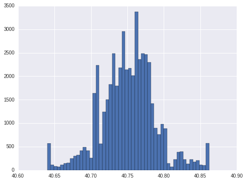
1.3. check of latitude
The 1st and 99th percentile of latitude is 40.6404 and 40.862047. So it is reasonable of thinking 0 and 44.8835 as ourliers. We will floor and cap latitude by its 1st and 99th percentile.
lat_pct = np.percentile(train.latitude, [1, 99]).tolist()
print lat_pct

train['latitude'] = np.where(train['latitude'] < lat_pct[0], lat_pct[0],
                             np.where(train['latitude'] > lat_pct[1], lat_pct[1], train['latitude']))
[40.6404, 40.862047]
train['latitude'].hist(bins = 50)
<matplotlib.axes._subplots.AxesSubplot at 0x7fb00ff45610>
1.4. check of longitude
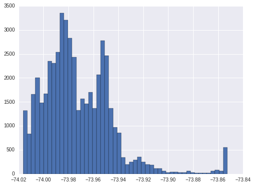
The 1st and 99th percentile of longitude is -74.0162 and -73.852651. So we will also floot and cap at these two numbers.
long_pct = np.percentile(train.longitude, [1, 99]).tolist()
print long_pct

train['longitude'] = np.where(train['longitude'] < long_pct[0], long_pct[0],
                             np.where(train['longitude'] > long_pct[1], long_pct[1], train['longitude']))
[-74.0162, -73.852651]
train['longitude'].hist(bins = 50)
<matplotlib.axes._subplots.AxesSubplot at 0x7faff2c0b490>
1.5. basemap of latitude and longitude
Since latitude and longitude indicates the location of the apartment. we can plot them on the basemap to get more intuitive impression about the location.
From the basemap plot, most of the apartments are on the island. It will be better if we can check the y distribution based on the combination of latitude and longitude. But since there are many combinations(more than 10000) of latitude and longitude in the data, it is not good way to do this. But this may indicate that we should re-group latitude and longitude in the model.
plt.style.use('ggplot')
new_style = {'grid': False}
matplotlib.rc('axes', **new_style)

rcParams['figure.figsize'] = (12, 12) #Size of figure
rcParams['figure.dpi'] = 10000

P=train.plot(kind='scatter', x='longitude', y='latitude',color='white',xlim=(-74.02, -73.85),ylim=(40.64, 40.86),
             s=.1, alpha=1, title = "basemap location plot based on latitude and longitude")

P.set_axis_bgcolor('black') #Background Color
train.ix[:, ['latitude', 'longitude']].drop_duplicates().shape
(10933, 2)
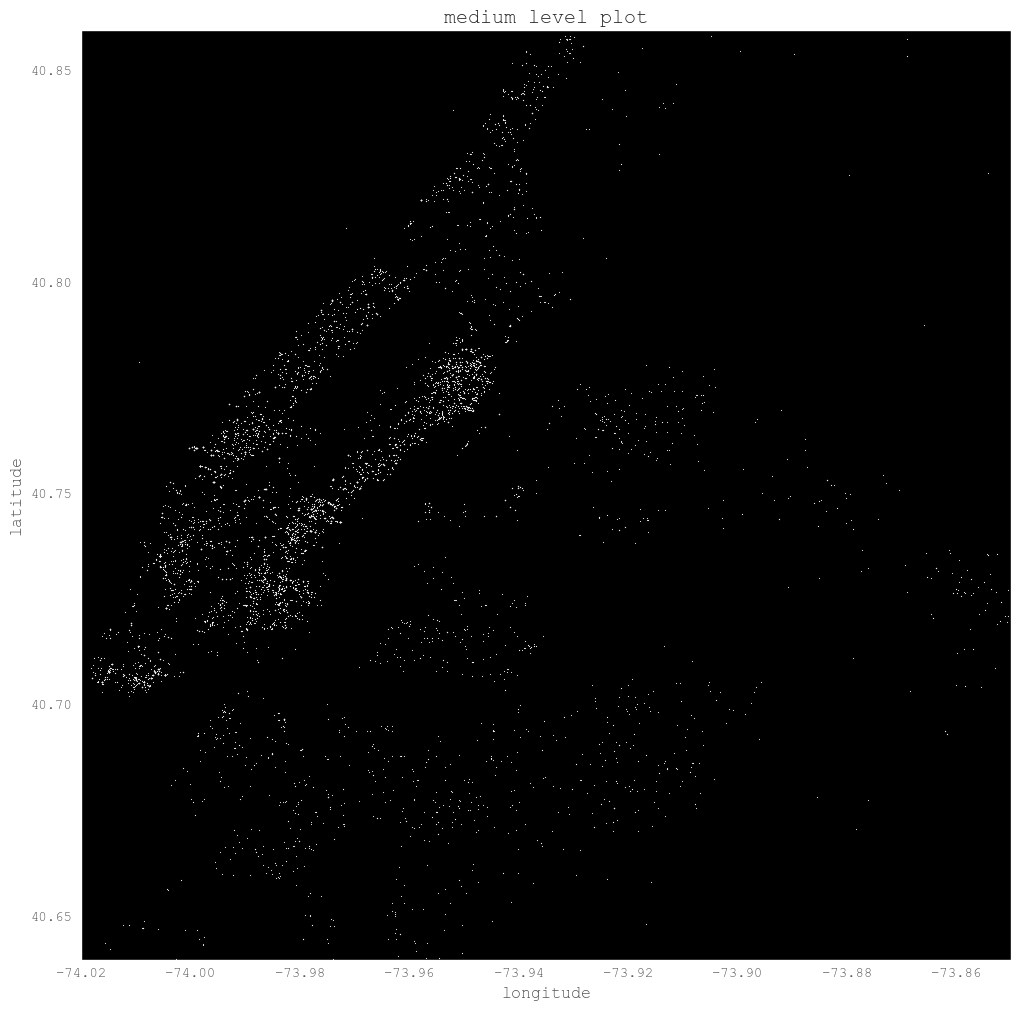
We can plot the high and medium level location to have a look if there is any special location of these levels. But from the plot it does not show special locations.
plt.style.use('ggplot')
new_style = {'grid': False}
matplotlib.rc('axes', **new_style)

rcParams['figure.figsize'] = (12, 12) #Size of figure
rcParams['figure.dpi'] = 10000

P=train.query('interest_level == "high"').plot(kind='scatter', x='longitude', y='latitude',color='white',
                                               xlim=(-74.02, -73.85),ylim=(40.64, 40.86),s=.1, alpha=1, title = "high level plot")
P.set_axis_bgcolor('black') #Background Color
plt.style.use('ggplot')
new_style = {'grid': False}
matplotlib.rc('axes', **new_style)

rcParams['figure.figsize'] = (12, 12) #Size of figure
rcParams['figure.dpi'] = 10000

P=train.query('interest_level == "medium"').plot(kind='scatter', x='longitude', y='latitude',color='white',
                                                 xlim=(-74.02, -73.85),ylim=(40.64, 40.86),s=.1, alpha=1, title = "medium level plot")

P.set_axis_bgcolor('black') #Background Color
1.5. check of price
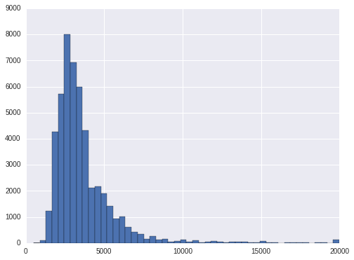
The 1st and 99th percentile of price is 1475 and 13000. To be reasonable, we can floor and cap at 500 to 20000 for price.
price_pct = np.percentile(train.price, [1, 5, 95, 99]).tolist()
print price_pct

train['price'] = np.where(train['price'] < 500, 500,
                             np.where(train['price'] > 20000, 20000, train['price']))
[1475.0, 1800.0, 6895.0, 13000.0]
train.price.hist(bins = 50)
<matplotlib.axes._subplots.AxesSubplot at 0x7f94bd61f7d0>
Let's have a look at the price level at each interest_level. To avoid the bias in case of outliers, we will use median to compare. As is shown, the high interest level has the lowest median price, the low interest level has the highest price. That is, the higher the price, the less interest it is.
The same conclusion is there for price per bedroom. We can also find the median bedrooms for hign and medium are 2 while the bedrooms for low level is 1.
train.groupby('interest_level').price.median()
interest_level
high      2400
low       3300
medium    2895
Name: price, dtype: int64
train['pricetobedroom'] = train.price / train.bedrooms
train['pricetobathroom'] = train.price / train.bathrooms

print train.ix[:, ['interest_level', 'price', 'bedrooms', 'bathrooms', 'pricetobedroom', 'pricetobathroom']]\
.groupby('interest_level').agg('median')
                price  bedrooms  bathrooms  pricetobedroom  pricetobathroom
interest_level
high             2400         2        1.0          1625.0           2300.0
low              3300         1        1.0          2700.0           2995.0
medium           2895         2        1.0          1887.5           2650.0
1.6. locations having only one rating
For hign interest ratings, there are about 20% locations only have high rating. For medium ratings, it is also about 20% of the locations only have medium ratings. For low ratings, there are about 33% of the locations only have low ratings. For the other locations, they have more than 1 ratings. For these locations only have one rating, shall we only predict one rating for them? Or at least we should take them out from modeling.
grp = train.groupby(['latitude', 'longitude'])
cnt1 = grp.interest_level.apply(lambda x: x.value_counts()).reset_index(name="interest_level_cnts")
cnt2 = grp.size().reset_index(name = 'size')
cnt = pd.merge(cnt1, cnt2, how = 'inner', on = ["latitude", "longitude"])
cnt['pct'] = cnt.interest_level_cnts / cnt.ix[:, 'size']
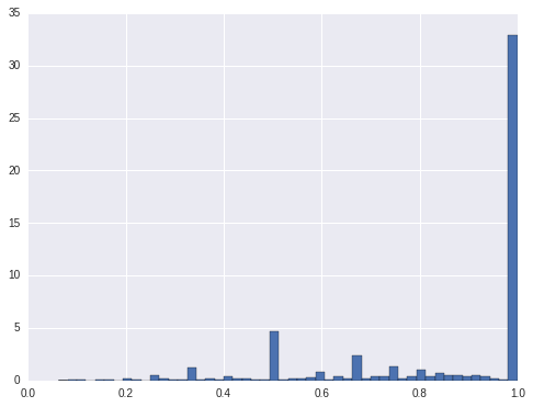
cnt.query('level_2 == "high"').sort_values('pct').pct.hist(bins = 50, normed=True)
plt.plot()
[]
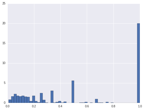
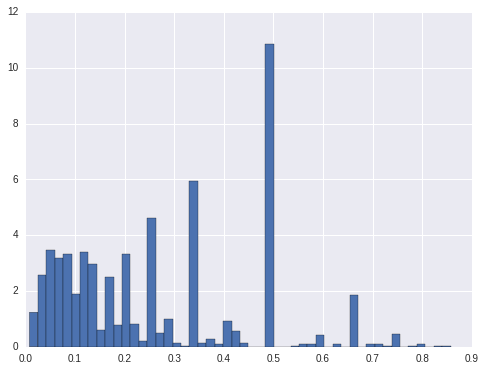
cnt.query('level_2 == "medium"').sort_values('pct').pct.hist(bins = 50, normed=True)
plt.plot()
[]
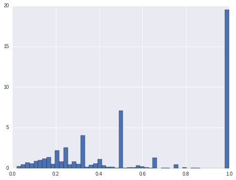
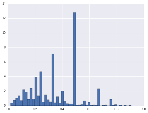
cnt.query('level_2 == "low"').sort_values('pct').pct.hist(bins = 50, normed=True)
plt.plot()
[]
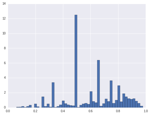
cnt.query('level_2 == "high" & pct < 1').sort_values('pct').pct.hist(bins = 50, normed=True)
<matplotlib.axes._subplots.AxesSubplot at 0x7f94b74a1e50>
cnt.query('level_2 == "medium" & pct < 1').sort_values('pct').pct.hist(bins = 50, normed=True)
<matplotlib.axes._subplots.AxesSubplot at 0x7f94bdd6e350>
cnt.query('level_2 == "low" & pct < 1').sort_values('pct').pct.hist(bins = 50, normed=True)
<matplotlib.axes._subplots.AxesSubplot at 0x7f94b75d3910>
cnt_mix = cnt.ix[:, ['latitude', 'longitude', 'pct']].query('pct < 1').drop_duplicates(['latitude', 'longitude'])
train_mix = pd.merge(train, cnt_mix, how = 'inner', on = ['latitude', 'longitude'])

print train_mix.ix[:, ['interest_level', 'price', 'bedrooms', 'bathrooms', 'pricetobedroom', 'pricetobathroom']]\
.groupby('interest_level').agg('median')
                price  bedrooms  bathrooms  pricetobedroom  pricetobathroom
interest_level
high             2600         2        1.0     1683.333333           2450.0
low              3345         1        1.0     2800.000000           3000.0
medium           2950         2        1.0     1950.000000           2700.0
1.7. character variables
displary_adress, description, features and street_address are the character variables. display_adress is not normalized characters, which have special characters like ' ,.$# ' and so on. We will first remove these special characters and then strip to remove leading and tailing blanks, and then compress to remove the multiple blanks in the middle.
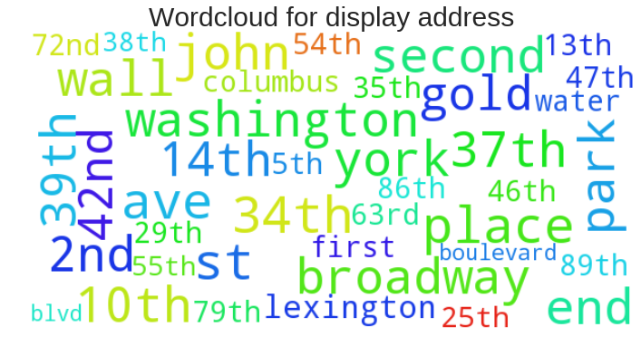
After cleaning display_adress, wall st, broadway, e 34th st, second ave and w 37th st are the location with most listings.There are about 4k locations with only one listing.So either we don't include it in the model or we have to combine the address since it has too many levels.
A good way to display these characters is word cloud. It shows the size of the character in accordance with its frequency: the higher the frequency of the character, the bigger the size is. The following will show how to draw the wordcloud.
train['display_address2'] = train.display_address.map(lambda x: " ".join(x.strip("-,.$*!#&\'\t").replace("'",'').lower()\
                                                                         .replace('street', 'st').replace('avenue', 'ave')\
                                                                         .replace('east', 'e').replace('west', 'w').split()))
train['display_address2'].value_counts(dropna = False)[:20]
wall st          451
broadway         443
e 34th st        441
w st             412
second ave       370
w 37th st        370
john st          346
gold st          345
york ave         316
washington st    304
w 42nd st        295
columbus ave     292
lexington ave    283
e 39th st        281
water st         280
first ave        268
e 79th st        253
e 35th st        251
w 54th st        240
e 89th st        238
Name: display_address2, dtype: int64
from wordcloud import WordCloud
display_address_word = ' '.join(train['display_address2'].values.tolist())

plt.figure(figsize=(12, 9))
wordcloud = WordCloud(background_color='white', width=600, height=300, max_font_size=50, max_words=40).generate(display_address_word)
wordcloud.recolor(random_state=0)
plt.imshow(wordcloud)
plt.title("Wordcloud for display address", fontsize=30)
plt.axis("off")
plt.show()
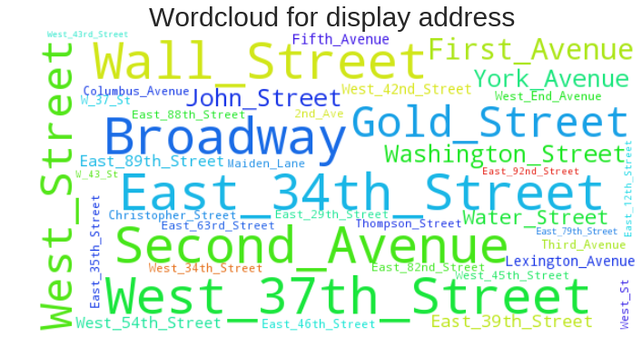
display_address_word2 = ' '.join(train.display_address.map(lambda x: '_'.join(x.strip().split(" "))))

plt.figure(figsize=(12, 9))
wordcloud = WordCloud(background_color='white', width=600, height=300, max_font_size=50, max_words=40).generate(display_address_word2)
wordcloud.recolor(random_state=0)
plt.imshow(wordcloud)
plt.title("Wordcloud for display address", fontsize=30)
plt.axis("off")
plt.show()
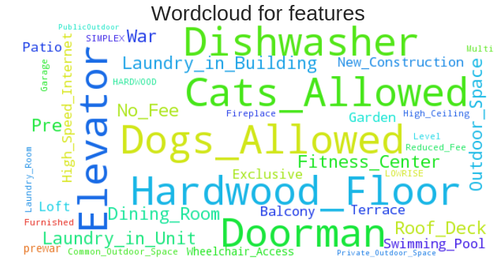
feature_list = train.features.values.tolist()
feature_list_all = [item for sublist in feature_list for item in sublist]
feature_list_all_norm = map(lambda x: "_".join(x.strip().split(" ")), feature_list_all)
feature_list_all_norm_ = " ".join(feature_list_all_norm)

plt.figure(figsize=(12, 9))
wordcloud = WordCloud(background_color='white', width=600, height=300, max_font_size=50, max_words=40).generate(feature_list_all_norm_)
wordcloud.recolor(random_state=0)
plt.imshow(wordcloud)
plt.title("Wordcloud for features", fontsize=30)
plt.axis("off")
plt.show()
2. Distribution of y on x
From above analysis we got the clue that number of bedrooms and price are the two very important variables. Here we will show a little more relation between y and x.
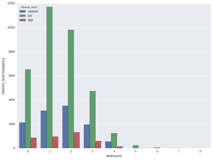
2.1. high/low/medium counts on number of bedrooms
For each number of bedrooms(0, 1, 2...) we can count how many times high/low/medium occurs. From the graph below, the 1 bedroom occurs most, next by two bedrooms, and then 0 bedrooms. For each of these, low appers most, then medium. hign appears least.
plt.figure(figsize=(12, 9))
ax = sns.countplot(x='bedrooms', hue='interest_level', data=train)
plt.ylabel('Interest_level frequency', fontsize=12)
plt.xlabel('bedrooms', fontsize=12)
plt.show()
But this only tell us the counts. It does not tell us the distribution of interest_level on different bedrooms. Next we will calculate the percentage.
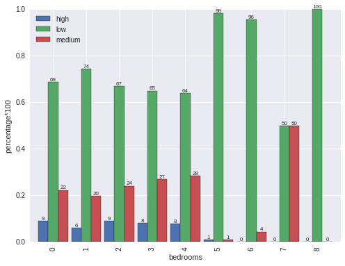
From the analysis, we can find low rate is a little high on bedroom=1 than the others from 0 to 4. On 5, 6, 7 and 8, the low rate is very high which is almost 1. So we can have the rough conclusion that if bedrooms is more than or equal to 5, it is very likely it will be low interest.
f = lambda x: x.value_counts()/x.shape[0]
s = train.groupby('bedrooms').interest_level.apply(f)
s = s.unstack(level = -1)

fig, ax = plt.subplots()
s.plot.bar(width = .9, ax = ax)
for p in ax.patches:
    ax.annotate(int(np.round(p.get_height()*100)), (p.get_x()+p.get_width()/2., p.get_height()), \
                ha='center', va='center', xytext=(0, 3), size = 8, textcoords='offset points')

plt.legend(loc = 0)
plt.ylabel("percentage*100")
<matplotlib.text.Text at 0x7f94bddf2750>
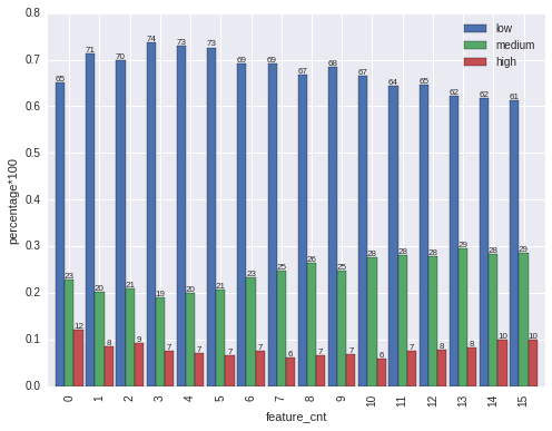
2.2. counts of features v.s. y
Features is a list with different kind of keywords. We can apply text mining on it. But the easiest way if to check the feqture keyword counts v.s. y.
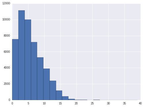
From the feature_cnt histogram, there is only few with more than 15 features. so we will cap at 15.
From the percentage plot, we can find features count from 0 to 3, low interest is increasing, medium interest is decreasing. After 4, low interest is decreasing and medium interest is increasing. For high interest, it is high on two tails(start and end), and it is low in the center.
train['feature_cnt'] = train.features.map(lambda x: len(x))

train['feature_cnt'].hist(bins = 20)
train['feature_cnt'] = np.where(train['feature_cnt']<=15, train['feature_cnt'], 15)

f = lambda x: x.value_counts()/x.shape[0]
s = train.groupby('feature_cnt').interest_level.apply(f)
s = s.unstack(level = -1)

fig, ax = plt.subplots()
s.plot.bar(width = .9, ax = ax)
for p in ax.patches:
    ax.annotate(int(np.round(p.get_height()*100)), (p.get_x()+p.get_width()/2., p.get_height()), \
                ha='center', va='center', xytext=(0, 3), size = 8, textcoords='offset points')

plt.legend(loc = 0)
plt.ylabel("percentage*100")
<matplotlib.text.Text at 0x7f94bdb6ddd0>
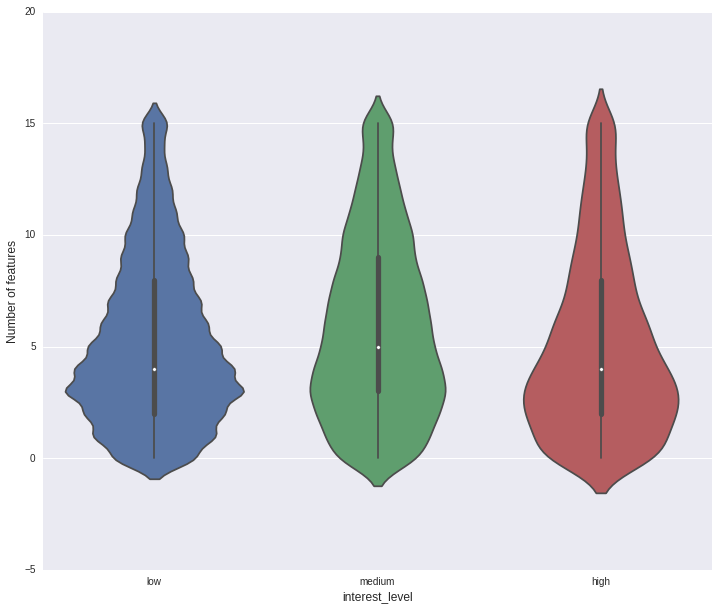
Another popular plot to show the realtion at different level is violin plot.
plt.figure(figsize=(12, 10))
sns.violinplot(y="feature_cnt", x="interest_level", data=train, order =['low','medium','high'])
plt.xlabel('interest_level', fontsize=12)
plt.ylabel('Number of features', fontsize=12)
plt.show()
Next we will begin to build models based on the analysis above.