Suppose in the data there is a column called yq, which is the year and quarter. we want to make this yq as the x tick in the plot. if you simply plt.plot(df.yq, df.actual), it will not work because of the scale of yq.
The solution is to set the size of the data as x in the plot, and then reset the tick by the yq value.
# carete the sample data
df = pd.DataFrame(columns = ['yq', 'actual', 'pred'])
df['yq'] = [200702, 200703, 200704, 200801, 200802, 200803, 200804, 200901, 200902, 200903]
np.random.seed(999)
df['actual'] = np.random.random(10)
df['pred'] = df['actual'] + np.random.normal(0, 0.1, 10)

plt.subplot()
# plot x from 1 to 10, like a time series
plt.plot(range(1, df.shape[0] + 1), df.actual, label = 'actual')
# also x from 1 to 10
plt.plot(range(1, df.shape[0] + 1), df.pred, label = 'pred')
# set yq as the x tick
plt.xticks(range(1, df.shape[0] + 1), [str(int(x)) for x in df.yq.tolist()], rotation = 'vertical')
plt.legend()
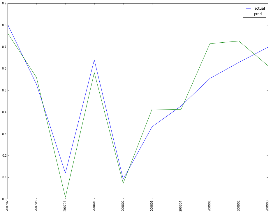
This is for the plot of the IFRS9 predicted data and actual data.
#1. make up code to generate the sample data
rating = ['A', 'B', 'C']
yq = [200701, 200702, 200703, 200704, 200801, 200802, 200803, 200804,
      200901, 200902, 200903, 200904, 201001, 201002, 201003, 201004]
# multiple index from two list combination
tindex =  pd.MultiIndex.from_tuples(list(itertools.product(rating, yq))*20, names = ['rating', 'yq'])
testdata = pd.DataFrame(columns = ['actual', 'pred'], index = tindex)
testdata['actual'] = np.random.random(len(tindex))
testdata['pred'] = testdata['actual'] + np.random.normal(0, 0.1, len(tindex))
# set index to columns and sort it
testdata.reset_index(inplace = True)
testdata = testdata.sort(['rating', 'yq'])
# add the cumulative qtr for the data, although I know it is 20 here. but in actual, it varies for different pdrr & yq
grouped = testdata.groupby(['rating', 'yq'])
qtrs = []
for name, group in grouped:
    qtrs = qtrs + range(1, group.shape[0] + 1)

testdata['qtrs'] = qtrs

# define the plot function
def vertical_compare(indata = testdata, qtr = 4):
    '''
    qtr=4 for 1 yr, 8 for 2 yrs, 12 for 3 yrs
    '''

    allpdrr = indata.rating.unique()
    allpdrr_len = len(allpdrr)

    for i in range(allpdrr_len):

        pdrr = allpdrr[i]

        plt.subplot(math.ceil(allpdrr_len / 2.0), 2, i + 1)

        df = indata.ix[(indata.rating == pdrr) & (indata.qtrs == qtr), :]

        # in the title with 'y=0.85' to adjust the position of the title; '>1' will be outside the plot
        plt.title(str(qtr/4) + " yr pd plot for rating --- " + pdrr, y = 0.85)
        plt.plot(range(1, df.shape[0] + 1), df.actual, label = 'actual')
        plt.plot(range(1, df.shape[0] + 1), df.pred, label = 'pred')
        # to make the tick on x plot as yq, which is one of the data column
        plt.xticks(range(1, df.shape[0] + 1), [str(int(x)) for x in df.yq.tolist()], rotation = 90)
        plt.legend()
        # with 'tight_layout()' the graph looks better
        plt.tight_layout()

    plt.show()
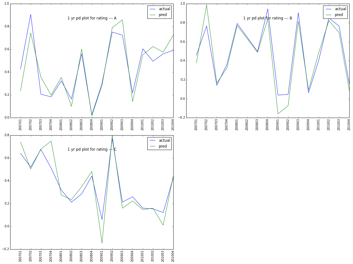
As you can see, it is a little crowd in the x ticks. Can we hide some ticks so that it is more clearly shown? The awnser is yes. We can adjust the xticks as below. if it is plot in fig, ax = plt.subplot(), then you can use set_visible(False) to adjust as shown in the reference.
# define the plot function
def vertical_compare(indata = testdata, qtr = 4):
    '''
    qtr=4 for 1 yr, 8 for 2 yrs, 12 for 3 yrs
    '''

    allpdrr = indata.rating.unique()
    allpdrr_len = len(allpdrr)

    for i in range(allpdrr_len):

        pdrr = allpdrr[i]

        plt.subplot(math.ceil(allpdrr_len / 2.0), 2, i + 1)

        df = indata.ix[(indata.rating == pdrr) & (indata.qtrs == qtr), :]

        # in the title with 'y=0.85' to adjust the position of the title; '>1' will be outside the plot
        plt.title(str(qtr/4) + " yr pd plot for rating --- " + pdrr, y = 0.85)
        plt.plot(range(1, df.shape[0] + 1), df.actual, label = 'actual')
        plt.plot(range(1, df.shape[0] + 1), df.pred, label = 'pred')
        # to make the tick on x plot as yq, which is one of the data column
        plt.xticks(range(1, df.shape[0] + 1)[::2], [str(int(x)) for x in df.yq.tolist()][::2], rotation = 90)
        plt.legend()
        # with 'tight_layout()' the graph looks better
        plt.tight_layout()

    plt.show()
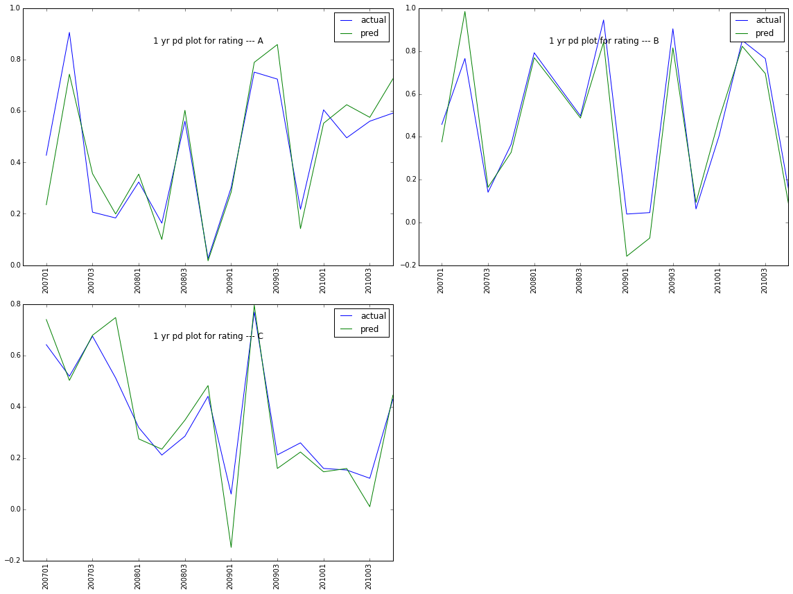
Reference:
ticks_and_spines example code: ticklabels_demo_rotation.py